To give some products a high class tone of voice it uses serif typefaces. Once again this type is given a minimal use but this time is paired with colours that are lower in tone and look faded. These pastel colours are very popular in modern design.
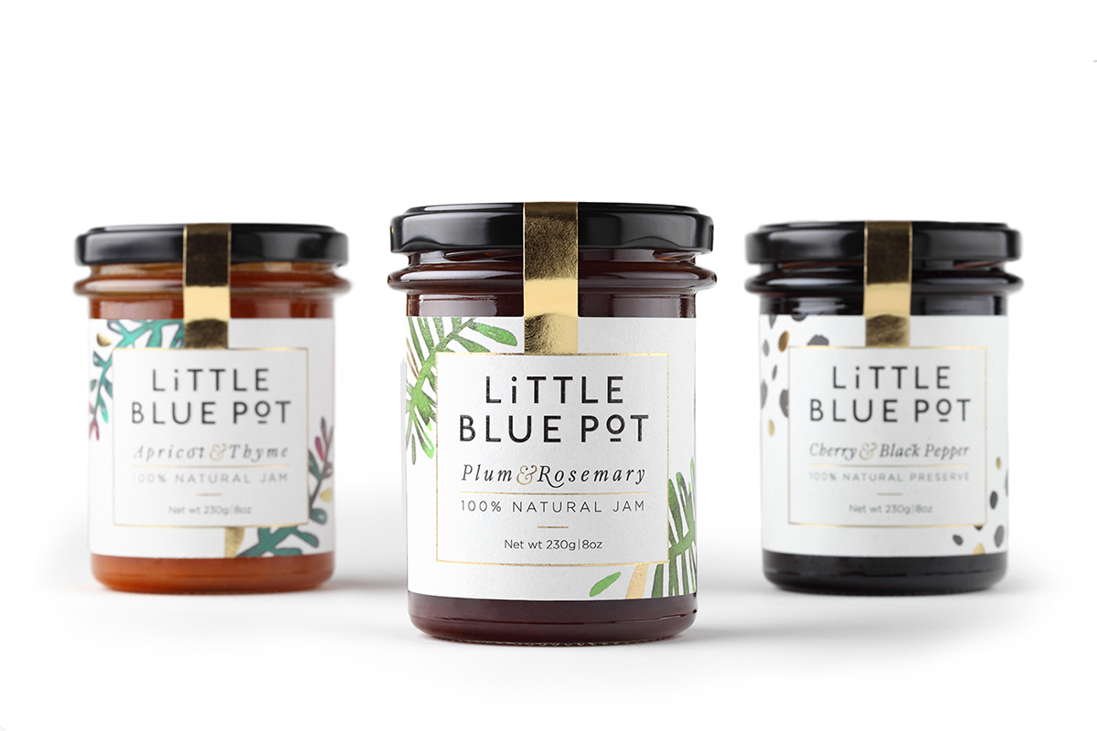
Some examples of packaging use small simple illustrations The example bellow uses elegant, naive paintings. The use of colour illustrations are simple and don't overpower the whitespace which is an important part of the design.
The use of packaging holds specific tones of voices, jars and bottles with corks and stoppers give the product and elegant tone of voice. Sometimes the label is used to colour the packaging instead of including coloured illustration or shape.
The use of white space is very popular in contemporary design. It makes the product look clean and polished. However the use of layout and composition is very important and if done wrong can look unprofessional and look as though the designer was lazy. To avoid this, small use of colour and experimental layout of typography can create an intriguing design.


No comments:
Post a Comment