Monday, 22 January 2018

OUGD601 - Synergy & Evaluation

This module was approached with an interest in film, an area of design where an interest has always been. It has benefited my own practice to explore the area critically and practically. To keep on top of the exploration, a timescale plan was created, which wasn’t kept to solidly. The written work was left a little last minute however all the tutorials were attended on time, and planned sessions, the photography reservation and personal print deadline helped to ensure the practical work was met on time. However, I am impressed with my abilities to complete the written work still on time even though it was left a little late.

Film has always been an area of interest and one I hope to go into in industry, so exploring this and growing my knowledge in film and production design has benefitted my practice. I now have a working knowledge in film art direction I can take forward into any future projects. The research was all relevant and contributed to the project. All the research that was taken for the critical essay as well as the practical work informed the design that was produced. There is a combination of academic and visual sources to ensure the body of research was sound. The practical work is evidence for the critical essay, proving that there is a relationship between graphic design and film art 
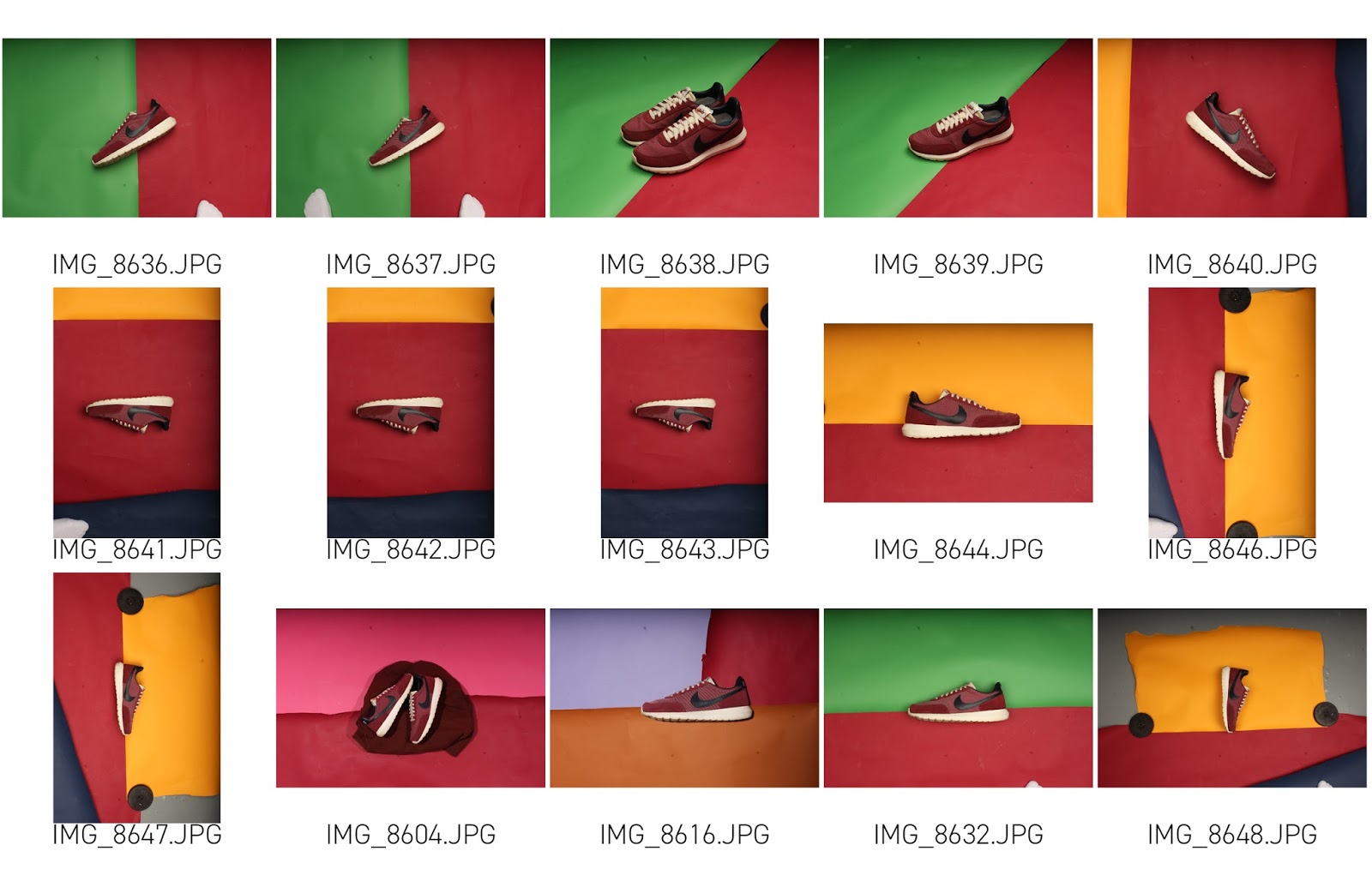
direction. The final practical design was influenced by both production design and graphic design, merging the use of production design and colour theory in the photography and using graphic design knowledge to inform a successful design.

It developed well into a solid body of research. To begin with the research question title was vague and needed to be fine-tuned in order to give it a solid focus. The practical work naturally developed into solid evidence for the critical essay. It samples current trends in advertising to inform its design, making it professional and relevant. The critical essay itself demonstrates an awareness of trends in design spanning over the last century. The final 
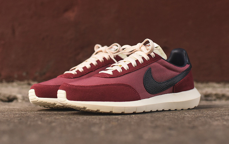
practical work is at a professional standard and there isn’t much that could be improved. It suits the Nike ‘look’ and overall has a professional and realistic finish. It could be seen as a genuine campaign and has been presented well in an appropriate mock up.


I enjoyed the project as it is an area of interest to myself as well as an area I hope to go into in industry. I think overall the photography element of the design was particularly successful combining with the colour theory knowledge in the critical essay. It overall informed a strong design and I am pleased with it.

Sunday, 21 January 2018

Wednesday, 17 January 2018

OUGD601 - Practical Final Development and Feedback

The final photos were developed into advertising posters. Using Nike's current brand and identity art direction, each colour harmony is paired with a typographical poster. The retro logo used on the trainer is used on the posters and the typeface used is Futura. A variety of poster concepts were developed to see which advertising poster would be stronger. A short and snappy slogan has been added to sell the trainer, which is an old, revived shoe silhouette, and is a popular selling technique used by Nike. 


Once created, they were pitched to group for feedback. Everyone agreed that creating the adverts as a pair was strongest. The type added to the triadic poster and the analogous poster looks forced and would be stronger if all the colour harmonies were paired with a typographic poster. The complimentary posters worked well however, the type on the typographic poster has too much contrast, and the colours could be changed slightly so that its easier to read.

Some of the backdrops need cleaning up so it looks professional and although the typographic posters look uniform with the Nike logo centred, it would be more engaging if the photographic posters positioned the Nike logo in different corners so that overall, it will be more engaging and uniformed.

Once the changes were made and the posters were amended, they were ready to be presented as a full advertising campaign.


OUGD601 - Sneaker Design Concepts & Production

Now the idea to create sneaker advertising was determined, a pair of trainers were chosen. A pair of red Nike's were chosen because they are full of colour and the use of colour harmonies can be explored.


Using the colour of the shoes, four colour pallets were produced with monochromatic, analogous, complimentary and triadic harmonies. This was done with the knowledge learnt from the research conducted for the critical essay.


Using these colours, and the knowledge from the sneaker research, some concepts to photograph the shoes were sketched. These sketches show how the shoes can be photographed using these colour pallets.


The shoes were then photographed in their environments. Using paper backdrops and other items of clothing, the four colour harmonies were created. As the trend in shoe advertising is quite minimal, there was only need to use a few colours and photograph the shoes on a flat surface. Using the initial sketches, a variety of shots were taken with them as a guide. Experimenting produced a variety of shots that can be used to develop into a final piece. 


All the photos were collected and will be taken forward to the final development.


Wednesday, 13 December 2017

OUGD601 - Practical Concept & Research into Sneaker Advertising

To demonstrate the relationship between art direction in film and graphic design, the practical research will develop a piece of graphic design using art direction techniques. Colour harmonies being one of the most contemporary techniques that keeps the relationship between the two, will be the main focus of the practical research.

Sneaker advertising will be the most successful practical exploration. The 'sneaker' trend is very popular at the minute, especially with Nike's rereleasing classics on anniversaries. Advertising for trainers is often done on social media platforms such as Instagram or Facebook and successfully uses communities to promote through word of mouth. The current trends in trainer advertising is very minimal, often with simple photography and stripped back typography, and sometimes just with a simple photograph of the shoe. It is already a good example of use of colour in graphic design and it is very similar to some of the work looked at in the critical essay.


Existing advertising can already be seen using colour harmonies to their advantage, however not to the same extent that is often used in production design. Often, a simple one colour backdrop is used that compliments the shoe, it might be a matching tone of a part of the shoe. For example these adverts for the Nike Air Max 1 can be seen with simple one colour backdrops that compliment the shoe, the grey backdrops are a tone that can be seen on the shoe. In the second advert the forearm of the person holding the shoe has been painted to match the red on the shoe.


This next example is using a subtle analogous harmony. The red of the shoe can be seen reflected in the bangle of the arm holding it, and the backdrop is a subtle red tone that compliments the red in the shoe and the arm holding it. This analogous combination is satisfying to the audience and there is a visible unity.


In these converse adverts, the trainers are photographed with a backdrop that matches the colour of the shoe with another colour bursting through the backdrop that is complimentary of the shoe. Although engaging in colour, they could demonstrate more unity and be more engaging to an audience if they took advantage of the use of colour harmonies.


Sometimes trainers are shot in a more textured environment, typically in one that creates a monochromatic harmony. Whilst its monochromatic nature creates a relaxing pleasing image, the texture of the setting makes it engaging. The following examples are demonstrating a more successful use of colour harmonies.


Trainer adverts, although already demonstrating strong use of colours, can take advantage of the harmonies used in production design which will bring a unity overall making them more successful.

OUGD601 - Practical Research Feedback

After producing these initial ideas, they were pitched to a group for feedback. Overall the group were impressed with the ideas and helped to come up with a final concept. The group decided it would be best not to use a product from a film. It would benefit the research to do something different to detach itself from film as much as possible so it is stronger evidence for the essay.

They all agreed that exhibition curation wouldn't benefit the critical essay as much as it is too much of set or spacial design and the practical work should demonstrate how graphic design is being influenced by art direction. They also asked what would be curated and that to put an exhibition together would not be possible in the timescale.

They suggested using a product with less emotion to demonstrate how colour can produce emotion. This could be a mundane everyday object and they preferred the choice of advertising shoes. They can be taken advantage of to explore the colour harmonies.